March 5th, 2019 – It was at the 2019 Geneva Motor Show held in Palexpo, Switzerland that KIA first unveiled what will undoubtedly be the future of the company. The South Korean company unveiled three cars, a new KIA E-Soul, KIA Niro Range, and something outwardly concept car nicknamed “Imagine By KIA”. Of course, the KIA design game has always been a hot topic of discussion, but they outdid themselves this time. The E-SOul and Nitro Range were something to behold but the concept car stole the spotlight.
Apart from being an all-electric vehicle, Imagine by KIA featured the all-new “Tiger Mask” (), the roof and windscreen were designed with a single glass sheet, and the silver-chrome painting highlights the ripples on the chassis, which according to KIA’s design president, gives off the effect of shockwaves in a perfectly still lake. Carrying all these were 22-inch wheels with transparent acrylic glass inserts, bespoke tires (manufactured by Goodyear) capable of detecting road conditions, seats covered with leather and silk, and 21 thin screens adorning the dashboard.
If you think that is too much, you are probably right. The screens are not going to make it to the production models. But hey, that isn’t all that KIA unveiled on that day. One subtle yet telling difference between the concept car and other models revealed during the show was the KIA Logo. While the E-Soul and Nitro Range both came with the familiar KIA Logo (Oval with text KIA in the center), the concept Car had a different logo. It was a hint of what’s to come, and in this article, I’ll be talking about the new KIA logo and the idea behind it.
KIA Logo Evolution
Launched in 1944, the KIA motor company has undergone several transformations. Before becoming an automobile manufacturer, KIA used to manufacture bicycle parts. After producing its first car, Brisa, in 1970, KIA has continued to engage in the automobile industry, producing motorcycles, trucks, and cars under its parent company Hyundai Motor Group. As did the business, the KIA brand logo has also evolved over the years. Trust me, it wasn’t always the simple three-red letters with an oval circle we know too well.
But one thing remained constant, the company’s logo had always been a reflection of its rebranding at any point in time. For instance, at the time the company released its first logo, it was still producing bicycle parts. So it shouldn’t be so surprising that the first logo looked like a cogwheel similar to that found on bicycles with the word KIA in the center. This was the official brand logo from 1953 to 1964. In 1964, a new logo was introduced, which had a much more simplified form than its predecessor. The logo looked like an inverted Q and was used for 22 years.
During this period, KIA ceased manufacturing automobiles, and when it returned to the business in 1986, a new logo was introduced. Once again, the company returned to the use of letters for its logo. In this case, the letters carried the design of a chimney with a puff of smoke (represented by a wavy blue line) coming from it. In 1994, the logo evolved once more to the simplified version that has graced most of the company’s automobiles for the past 27 years.
On January 6th, 2021 – KIA once again introduced a new brand logo amidst displays of fireworks launched from 303 drones. The celebration, which took place at Incheon, South Korea, did not only mark the company’s official rebranding but also set a new Guinness World Record for “Most unmanned aerial vehicles launching fireworks simultaneously. I am sure you might be asking yourself the same question that countless others have asked;
What Was Wrong with the Former Kia Logo?
Quite frankly, nothing. But speaking about the former logo, KIA CEO Ho Sung Song said, “it was long-in-the-tooth”. A metaphor that means the former logo was old. Considering that KIA had branded their vehicles with the logo for 27 years (1994 – 2021). One could see where the CEO was coming from. However, there’s been a lot of discussion surrounding the new design, one being that brand logos are like good wines that age well. This means that the older the logo, the more it grows on people.
Familiarity is a brand’s best friend and that is what the previous logo has over the new one. People knew it and could relate it to the history of KIA over the years. Under the previous logo, KIA had risen from a “little-known brand”, into a global player in the automobile industry. The three-row KIA Telluride won the 2020 SUV of the Year and the compact but comfy KIA Altos. The new logo hardly has such a powerful history behind it except for the promises of the company executives.
But then, with the introduction of new KIA models like the E-Soul, Nitro Range, and the all-revamped Imagine Concept Car, the new KIA logo will pick up the pace with time. So let’s not be too hard on it. I’m sure we will all learn to love it if we get over this one thing.
Kia New Brand Logo Design and Inspiration
KIA’s latest brand logo is a memento of its future ambitions. The company revealed in a press release that the new logo signifies the company’s “ambition to establish a leadership position in the future mobility industry by revamping nearly all facets of its business”. But before we get into all that, let’s talk about the new logo.
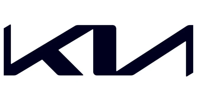
Simply put, the new logo looks like a handwritten signature of the word KIA. The cursive is unmistakable as each letter of the word is made to touch each other creating continuity. This was all done intentionally. KIA explained that the rhythm and unbroken lines of the logo show its commitment to bringing inspiration, and the symmetry is a sign of its confidence (perhaps of seeing its commitment and promise through).
But they didn’t stop there. The company also emphasized on the rising gesture (referring to the wavelike motion of the logo) is symbolic of its ambition and what it will be offering to its customers. KIA sums all this up with a brand slogan to go along with the new logo. The slogan reads “movement that inspires”.
So why did they need a new logo? Besides being old, KIA’s CEO also pointed out that the automobile industry is evolving rapidly, and KIA is adapting to the changes in the industry. To do this, the company hopes to inspire its customers and challenge its employees to rise to the occasion by meeting the pace of the fast-changing industry. How exactly do they plan on doing this? That’s where Plan S comes in.
Kia Plan S – a Long-Term Strategy
What is Plan S? It is a strategy the company plans to follow as it transitions from manufacturing internal combustion engines to only electric vehicles. Despite some lingering drawbacks, it is clear that EV is the future of automobiles, and KIA hopes to position itself as a leader in everything EV in the nearest future. This is the reason behind the company’s new logo, mantra, and rebranding. Here is what Plan S entails.
First, the company wants to snatch up 6.6% of the global EV market with a full lineup of 11 battery EVs and a 25% share of its sales of eco-friendly cars by 2025. The company anticipation an increase in the demand for EVs globally by 2026. With this in mind, KIA is hoping to sell 500,000 EVs annually and 1 million eco-friendly vehicles globally, according to a press report. For this bold plan to succeed, the company must invest about 29 trillion won (roughly $25 billion) by the end of 2025.
To raise the capital needed, the company is hoping to reach an operating profit of 6% and about a 10.6% return on equity (ROE) if it is to maximize shareholder value. Maybe the company is taking on too much, and like the former CEO and president Han-woo Park said, “Plan S is bold and enterprising.” Indeed, much of the company’s plan depends on two things: its electric vehicles success and its enterprising mobility solutions. Mobility solutions, as used here, is an umbrella term embodying all services for EVs and other autonomous vehicles and the purpose-built vehicles (PBV) venture.
Conclusion
As you would expect, there have been more than a few opinions about the new logo. Most of it is centered around the fact that the logo seems to be very confusing. At first glance, one can easily see two letters KN (more like an inverted N). The characters become more apparent the more you ponder on them. Some believe that it will take a while for the new logo to settle in. The same people still advocate for the former logo, insisting it was good enough. To these groups of people, I would say change is inevitable and should be embraced as long as it is in a positive direction.
Iliah is the co-founder of Mechanic Ask, where he writes detailed step-by-step tutorials for repairs and mods. He also posts videos walking through things like engine swaps, suspension lifts, and tuning chips. Iliah uses his blog as an educational resource for car enthusiasts based on the knowledge he’s gained from 15 years as an ASE-certified master technician. His repair manuals provide even novice readers the confidence to take on big projects.